Home Decor Trends – The Key Colours for 2024
Estimated reading time 5 minutes
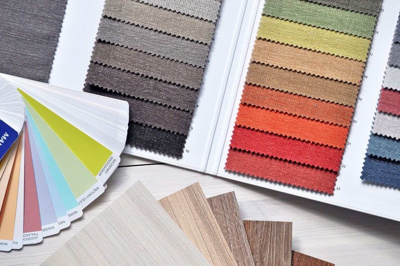
The new year is almost here, and we can’t wait to see what the home décor trends for 2024 will look like. The past few years have seen a focus on colour, personality, and creating our own personal haven in our home, and it looks like this trend will continue into the new year.
But what colours exactly will be trending in 2024? We collected some of our favourite shades that have been touted as being the next big thing and explored the best way to use them in your home.
Blush pink
Dulux’s colour of the year for 2024 is Sweet Embrace, a soft, dusky blush pink. The theme of Dulux’s colour for 2024 is to create “a place where you belong”, which is represented in the calming tones of Sweet Embrace. It’s the contrast to the bright, energetic Barbie pink that was everywhere in 2023.
The blush pink shade of Sweet Embrace is described as a delicate and optimistic colour. Inspired by soft feathers and evening clouds, it’s the perfect colour for those zen environments in your home, such as the bedroom. Dulux suggests combining Sweet Embrace with tangy, comforting orange shades for a cosy workspace, or natural green and blue tones in a calming kitchen.
Soft black
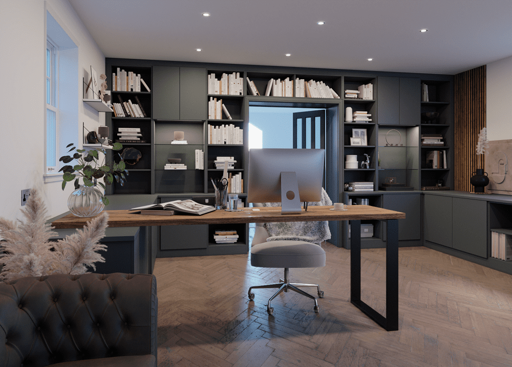
Behr announced their colour of the year for 2024 is Cracked Pepper, a versatile, soft black shade. This muted charcoal elevates any space, bringing sophistication and a contemporary feel. The colour can amplify any interior, from the kitchen to the living room, the bedroom and the bathroom. It can be used as an accent wall or really make a statement by painting every wall soft black.
The beauty of the soft black of Cracked Pepper is that it can be combined with just about any other colour, so you can create a bespoke feeling in your home. Behr suggest a rich burgundy to add to the dramatic feel, or a brick-tone orange for a bold look. Alternatively, you can keep it clean and simple with a creamy white shade alongside the soft black.
Violet blue
Benjamin Moore has named Blue Nova as their colour of the year in 2024. This violet-blue shade brings intrigue alongside reassurance, depth alongside a classic appeal. Benjamin Moore’s full 2024 colour palette has been inspired by travels and out-of-the-ordinary experiences, and features contrasting and complementary colours to Blue Nova, such as terracotta, honey yellow, dusky lilac, and blue-white.
You can really make a statement in your interiors with this violet blue shade by colour-drenching the entire room – that’s the walls, skirting, in-built storage and even the ceilings. Pair with furniture and artwork in contrasting orange or mustard yellow to add depth and dimension.
Fresh yellow
Glidden has announced their 2024 colour of the year as Limitless, a fresh, warm neutral-toned yellow. Limitless was chosen as the colour of 2024 thanks to its versatility – it brings a warmth that can amplify cool tones and compliment warm tones, but is still neutral enough to work on its own too.
Glidden’s 2024 colour palette features an array of shades to work with the fresh yellow colour. As well as neural tones such as soft greys, creams, and beiges, you can also add some punch with a rusty red shade or earthy orange tone. Limitless is ideal for brining personality to a well-used room such as the kitchen, without being overpowering. It’s also perfect for creating a calming, relaxing environment in a bedroom, and can be combined with natural greens and blues to bring the feeling of the outside in.
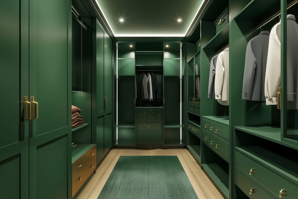
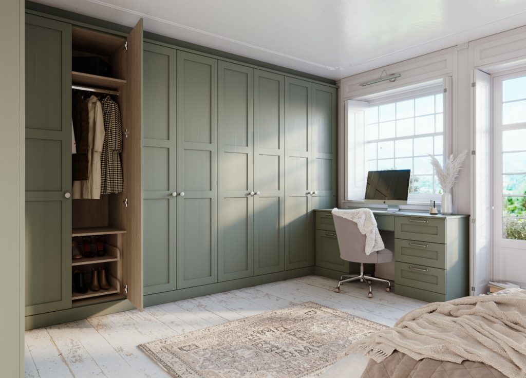
Deep olive
Dutch Boy’s 2024 colour of the year is Ironside, a rich, deep olive. The theme of Dutch Boy’s 2024 key colours is “embrace, retreat and inspire”. This is perfectly encapsulated in Ironside, which brings a warmth and sophistication to any space.
The deep olive shade is perfect for creating elegant, period-inspired interiors. Pair with gold ornaments, and rich wood furniture or hardwood floors for a welcoming, cosy feel. The shade works especially well with wall panelling, bringing a charm that’s both modern and vintage. Ironside also works great as an accent colour paired with Dutch Boy’s Whale’s Tail blue.
Dried peach
HGTV Home by Sherwin Williams has named Persimmon has the colour of the year for 2024. This is a dried peach shade with pink undertones, inspired by natural earthy colours. HGTV Home describes the shade as being perfect to bring softness and personality to the home.
This peach shade is versatile and can look just as good in the bathroom as in the living room. It looks gorgeous when contrasted with a soft black or charcoal as a backdrop, as this allows the peach colour to really pack a punch. For a more calming environment, you can combine Persimmon with other soft neutral tones, such as cream, olive green, and terracotta.
Looking to transform your home in 2024? Kingswood at Home designs, builds and professionally installs bespoke, made-to-measure wardrobes, blinds, and shutters. We can help to make your house a home this year, with a choice to suit any interior style. Contact us today for more information or to book your free, no-obligation design consultation.