11 Amazing Colour Combos to Rejuvenate Tired Living Rooms
Estimated reading time 5 minutes
As the gloomy weather of the British autumn sets in, what better time is there to refresh and rejuvenate your home with a fresh lick of paint? This feels particularly important right now as many of us are spending much more time than usual in our homes, and likely getting very, very bored of staring at the same old walls every day.
There are three approaches interior designers advise when it comes to matching colours together and we will explore these below.
Think About Temperatures
Colours can either be warm or cool. Typically, it’s best to pair cool colours with other cool colours - think fresh eggshell blue and mint green. Following suit, warms paired with other warm hues, such as soft beige and rustic orange, work well together.
Choose Complementary Colours
Opposites attract, so for a safe way to pick colour combos look no further than the colour wheel. Pick colours opposite each other, they will balance each other out and pair well.
Go Monochrome
Monochrome is a foolproof approach to picking out a new decor scheme. Simply use colours within the same family but with slightly different tones - they are certain to match and look wonderful in your home.
We’ve looked at the top colours of 2020 to bring you this cheat sheet to find the best colour combination for your living room, so get the mood board out and start planning your autumn redecoration project!
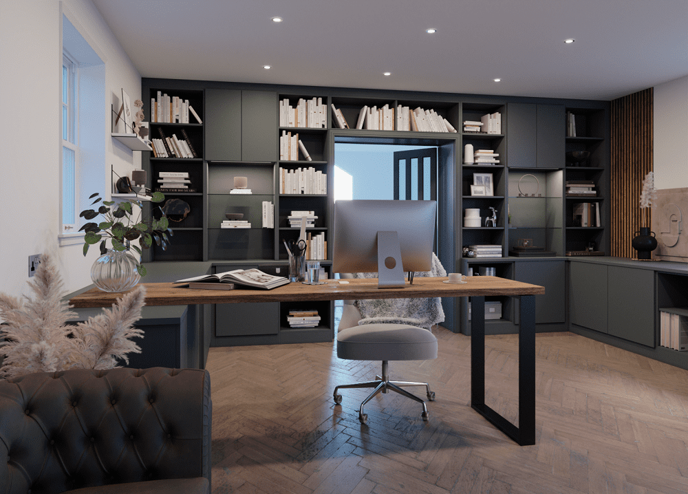
1. Black and Mossy Green
For the moody interior schemes, this combination is undisputed. Let the moss green sing here, adding in black trim or accents throughout the room. This natural shade of green has a subtle feel to it due to its underlying blue tone, and it works perfectly for rooms connected to gardens. For a softer feel try pairing it with an off-white instead of black.
2. Turquoise and Cream
Most colours (and desserts) go well with cream. It’s an interior staple and is best paired with bold, confident colours that can take the spotlight, whilst being softened by the gentler hues of its neutral companion. Turquoise remains a top trending colour for 2020, particularly shades dappled with emerald tones. Pair with brushed gold accessories to set off your scheme.
3. Brick Red and Tan
Another example of finding balance through pairing muted tones with bolder colours - brick red and tan will make a perfect partnership in most rooms of the home. This combination is, of course, perfect for those of us lucky enough to have exposed brickwork in our homes. Introduce your tan through elements such as sofas and plants (pampas grass is a great, contemporary option) and set them against your beautiful brick red wall.
4. Fuchsia and Ash Grey
This is a bold choice, perfect for larger lounges and open plan living spaces. Fuchsia is a playful colour, and an ideal choice for evoking a sense of summertime fiesta in your home. It benefits being used on big spacious walls where the colour can truly sing. Match with a contemporary grey to offset the boldness, and you’ll liven up your living room in no time.
5. Tangerine and Olive
This one is for those who want to truly ignore the impending seasons and invoke a Mediterranean feel in their home. Deep tangerine paired with earthy olive tones will happily create that vibe. Think of the colours of the winding streets of Sicily; natural yet vivid tones work spectacularly together.
6. Gold and Royal Blue
A classic and classy option - gold and royal blue complement each other well and are a wonderful choice for a cosy winter living room scheme. A deep, dark blue can seem like a risky option, but in the right context shadowy tones will come into their own. Bring in gold through accessories, or for a truly regal look, install bronze cast iron radiators.
7. Baby Blue and Pearly Pink
Pastel colours can create a dreamy Parisian feel for your home, and what better pair than soft blues and pearly pinks. Keep the tones muted for a cosy feel, and bring in neutral, organic tones like greige in your furnishings.
8. Forest Green and Indigo
Forest green has the unusual quality of making a room feel cosy in the darker months yet cool and shady in the summer. Embrace the organic feel and introduce materials like wood and leather for a pairing that’s direct from natural. Add in a shot of indigo for a room that exudes quiet confidence.
9. Monochromatic Blues
Pick two blues with the same hue but different tones for a complimentary colour combo; if you’d like to go further you can even introduce another shade into your palette, but if you do this be sure to bring in other colours such soft whites to offset the multi tonal design.
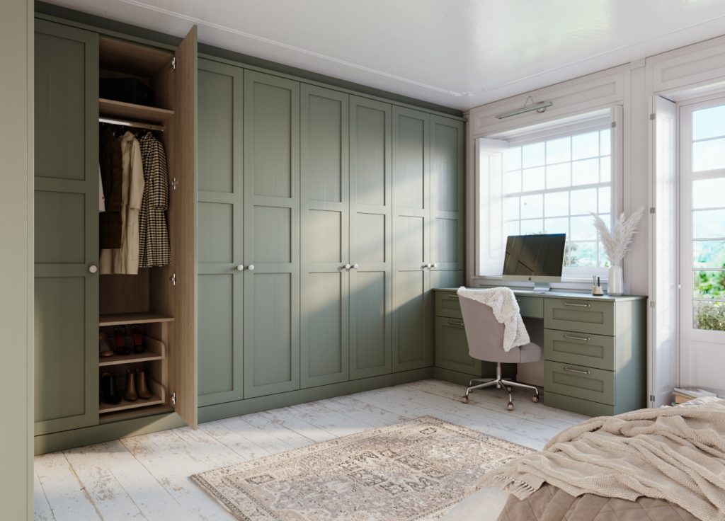
10. Blush and Dark Olive
A contemporary combination that promotes both serenity and comfort. Olive green is a wonderfully welcoming tone that sits perfectly alongside a soft blush. Farrow and Ball’s olive-toned Sap Green was one of their top colours of 2020, and we can see why. It’s got a strong mid-century feel and creates a welcoming, warming feel. Pair with soft pinks in the form of flowers or furniture to complete the look.
11. Peach and Black
A potentially unusual combination, setting stark black against the 1980’s favourite peach might seem odd, but it can create a striking impact. Peach has fallen out of favour in recent years, but when used right, this soft, warm shade can sit well in a contemporary scheme. Matt black works well with peachy hues - look for black standing lamps and picture frames to introduce an edge to the room.
We hope this colour combos inspire your next home decor project!
We offer a complimentary design visit in your home.
If you would like to get in touch with us about a project, please email us or call us on 0800 470 1112.