Understanding Colour Psychology in Interior Design
Estimated reading time 6 minutes
Colour plays a vital role in how we experience and interact with our living spaces. When we understand colour psychology in interior design, we can create environments that not only look appealing but also positively influence our mood and behaviour. In this blog, we’ll explore what colour psychology in interior design actually is, the effects of different hues, and how you can effectively combine them in your home.
What is colour psychology in interior design?
Colour psychology explores how colours influence our emotions, behaviours, and perceptions. It’s based on the idea that different hues can evoke specific feelings or reactions, which makes colour a powerful tool in shaping the atmosphere of a space.
In interior design, colour is much more than decoration; it affects how we experience a room, how comfortable or energised we feel, and even how we interact with others within it. Choosing the right colours can, therefore, enhance a room’s purpose, whether that’s creating calm and relaxation in a bedroom or fostering creativity and focus in a workspace.
The impact of different colours on mood and behaviour
Each colour carries its own set of psychological associations that can energise, soothe, or inspire us. Recognising these effects is key to using colour thoughtfully in interior design and establishing rooms that support specific emotions and activities.
Red: energy and passion
Red is a bold and dynamic colour that’s often linked with energy, passion, and excitement. It can stimulate the senses and increase the heart rate, which makes it a powerful choice for spaces where vitality and warmth are wanted, such as dining rooms or social areas. However, because of its intensity, red should be used carefully to avoid overwhelming a room. When balanced with neutral tones or used as an accent, red can create a striking and inviting atmosphere.
Blue: calm and trust
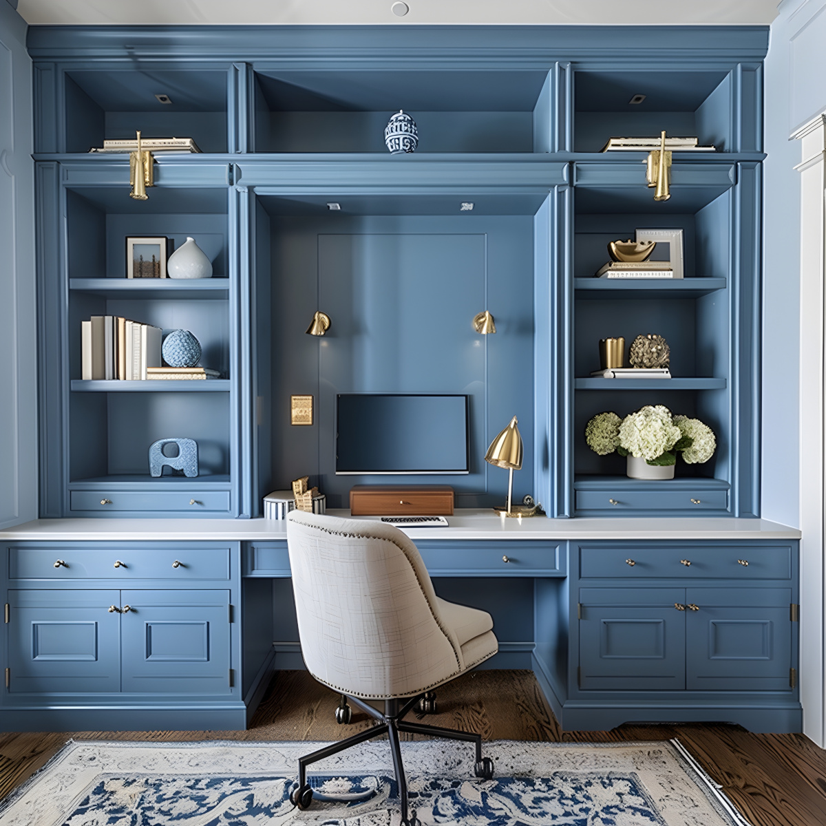
Blue is widely associated with calmness and trust, which makes it a popular choice for creating serene and stable environments. It has a soothing effect on the mind and body, and can help to reduce stress and promote relaxation. This makes blue particularly well-suited for bedrooms, bathrooms, and workspaces where focus and tranquillity are important. Depending on the shade, blue can also convey professionalism and reliability, which is why it is often used in offices and communal areas.
Yellow: happiness and creativity
Yellow is a bright and cheerful colour that often evokes feelings of happiness and creativity. It can energise a space and stimulate mental activity, which makes it a great choice for areas where inspiration and optimism are desired, such as kitchens, playrooms, or creative workspaces. However, because yellow is so vibrant, using it in moderation can help to prevent it from becoming overpowering or causing visual fatigue. When balanced with softer tones, yellow can bring warmth and positivity to any interior.
Green: balance and harmony
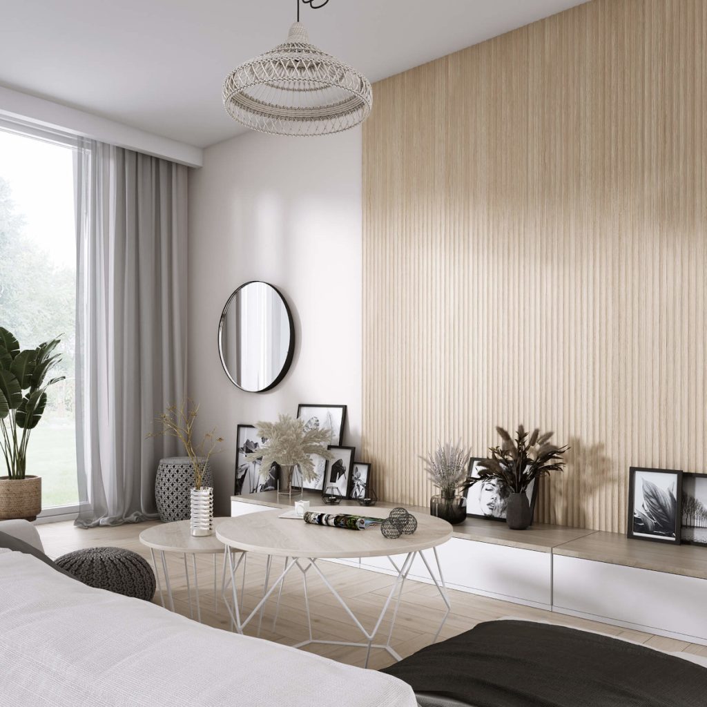
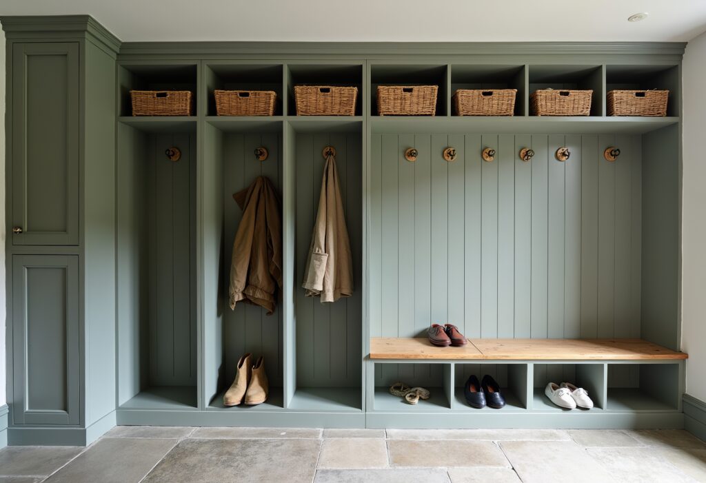
Green is closely associated with balance and harmony, often bringing a sense of calm and renewal to interior spaces. Inspired by nature, it creates a soothing environment that promotes relaxation and wellbeing. Green works well in almost any room, especially living areas and bedrooms, where a peaceful atmosphere is desired. Its versatility allows it to complement a wide range of colours and styles, which makes it a popular choice for those wanting a natural, grounded feel in their home.
Purple: luxury and creativity
Purple is traditionally linked to luxury, creativity, and sophistication. It can add a rich, elegant touch to interiors, often making spaces feel more opulent and unique. Lighter shades of purple such as lavender will bring a calming and imaginative vibe, whilst deeper hues such as plum or eggplant can create a more dramatic and regal atmosphere. When thoughtfully implemented throughout a space, purple can inspire creativity and add a sense of depth and refinement.
Neutral tones: comfort and sophistication
Neutral tones, such as beige, grey, and soft whites, provide a sense of comfort and sophistication in interior design. They create a calm and timeless backdrop that allows other colours and textures to stand out without overwhelming the space. Neutrals are highly versatile, working well in a variety of styles from modern to traditional, and help to make rooms feel balanced and inviting. Their understated elegance makes them a popular choice for those who want a subtle yet polished look in their homes.
How to effectively combine colours in your interiors
The key to creating a harmonious and visually appealing interior is in effectively combining colours. The right mix of shades can enhance a room’s mood, highlight features, and ensure a balanced flow throughout the space. When you understand how colours interact, whether through harmony or contrast, you can avoid clashes and create a cohesive design that feels both inviting and thoughtfully composed.
Colour harmony and contrast
Colour harmony involves selecting colours that work well together to create a pleasing and balanced look. This can be achieved by using colours that sit close to each other on the colour wheel, such as analogous colours, which provide a subtle and cohesive feel.
On the other hand, you can create contrast and visual interest by using colours that are opposite each other on the wheel, known as complementary colours. When used with intention, both harmony and contrast can enhance a room’s design - harmony for a calm, unified atmosphere, and contrast for a vibrant, dynamic effect.
Using colour accents and focal points
Using colour accents and focal points is an effective way to add interest and personality to a space without overwhelming it. Accent colours are typically applied in smaller doses, through cushions, artwork, or accessories, to create pops of vibrancy and draw attention. Focal points, such as a feature wall or a standout piece of furniture, use colour strategically to anchor a room and guide the eye. This approach allows for creativity and flexibility, giving a room character while maintaining overall balance and cohesion.
Colour flow between rooms
Colour flow between rooms is important for creating a sense of continuity and harmony throughout a home. Whilst each room can have its own personality, you can use related colours or complementary tones to help smoothly transition between spaces. This thoughtful coordination avoids visual disruption and will help to make the overall design feel cohesive.
How Kingswood at Home helps you set the mood with colour
Kingswood at Home specialises in creating bespoke joinery and storage creations that enhance the mood of any room through carefully considered colour choices. With our colour matching service, we’ll ensure that every piece complements your interior perfectly, helping to bring your vision to life with precision and style.
You can contact us to find out more about we can transform your space with personalised colour solutions or you can book your complimentary design appointment.
We offer a complimentary design visit in your home.
If you would like to get in touch with us about a project, please email us or call us on 0800 470 1112.